With the election just one week away, we’ve cast our vote on which of the primary parties we feel has the strongest approach when it comes to their marketing material.
We’ll look specifically at branding, websites and campaign material to understand the choices made and the implication of these choices.
Each party may address different issues and have different goals, but they should all try to pursuade people to support the party and encourage voters to tick their box on the ballot form. This is the fundamental ask, to grow the party.
Utilising a strong red colour to represent revolution and the rose for socialism, the Labour party stick to their traditions. Roses are also commonly associated with being red, giving their logo another level of logic.
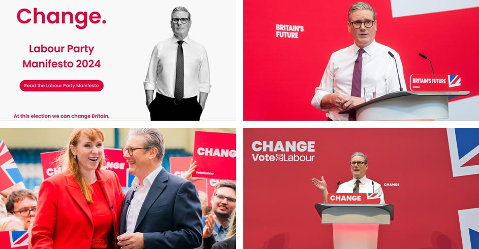
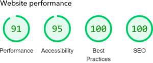
Credit has to be given to the overall website, it is clear, bold and interactive which will keep users engaged with party propaganda, increasing the chances of the user supporting the party. Interestingly, the Labour website sits in 2nd position on Google, when you search ‘2024 uk election’, meaning the website is ticking a lot of boxes. Only the UK Parliament General Election timetable page ranks above it.
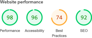
They also get a very respectable score when it comes to accessibility and overall performance.
As a socialist party which focuses on the struggles of the everyday people, all the photographs show Keir Starmer surrounded by smart looking people. If Labour is ‘for the people’ – images might be more effective if they were of Keir in everyday situations. The main image on the landing page is a typical election promo image with Keir holding a baby aloft, surrounded by people with red ties etc holding placards.
The slogan is simply ‘change’, but whether the change is good or bad is not defined. Just ‘change’, making the point that anything is better than the current situation. Not the most inspirational or supportive slogan, but a bold statement which belittles the current party in power. A one word slogan can be impactful, but sometimes feel a little abstract without further wording giving the slogan context.
You can view the Labour website here, and read the Labour manifesto here.

As part of the Conservative’s rebrand project in 2016, an oak tree was chosen to replace the older Olympic inspired emblem. The new logo represented “strength, endurance, renewal and growth”. The lines in the logo come across as artistic and organic which might not be qualities commonly related to the conservative party with their traditional and capitalist notions.
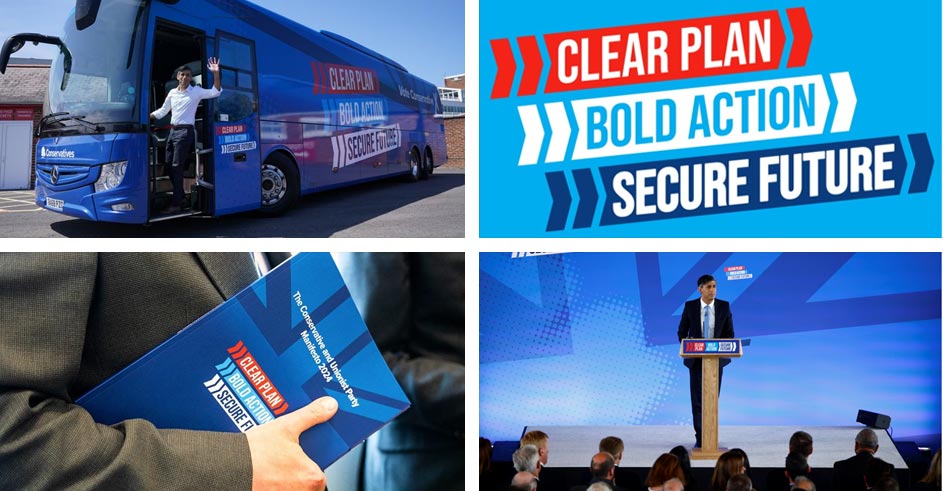
The Conservatives have certainly not been conservative with their branding. Clear, bold and with a strong sense of movement, its angled directional lines and shapes, gives the Conservatives consistency in its branding compared to others, making them come across as distinguished.
Photographs show Rishi in more everyday situations, talking to farmers, having a cup of tea, to try and come across as relatable. Lots of photos showing him performing speeches which try to present him as leader.
To show how committed the conservatives are to sending out the right message, you don’t need to look further than Rishi’s tie, if he’s wearing a tie, it’s pretty much guaranteed it’s going to be a share of blue.
Part of the visual language used by Conservatives, the UK flag is often faded in the background to give a subtle sense of nationalism.
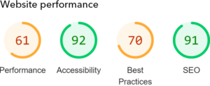
Not such a good score this time, when it comes to overall website performance.

The Reform Party maybe new, but it sits comfortably against the established Labour and Conservative Party branding. The Reform Party name alone implies that things have become fragmented and unifiying is the solution that will result in a better future.
The slogan ‘Let’s make Britain Great’ is simple wordplay on Great Britain, and the word ‘let’s’ implies a collaborative process which should connect with their voters. The slogan is catchy, memorable and plays on the notion that Britain was once great, but no longer is so, to deliberately relate to the older generation.
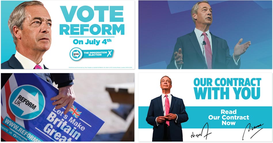
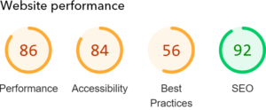
The Reform Party website is clean, simple and consistent in its branding. The cyan blue used as the main brand colour is an interesting choice, as you would think they would have chosen a colour from the UK flag. Reform clearly needed be more distinctive by using a more trendy shade of blue.
As the new guys on the block, the Reform Party have utilised a new website template with refreshing content, something the Green Party and Lib Dem Party website is seriously lacking.

The Lib Dems use the bird of liberty which was chosen as the party logo in 1989. The orange diamond with black band across it is reminiscent of road work signs which is hard to know if it was done deliberately or accidental. Over analysing this visual language, you could say Lib Dems are at work, building and making progress.
The slogan ‘Build a brighter future’ is emotive and constructive, however it isn’t reinforced enough across to really make impact, but is emotive and constructive, making it hard to pinpoint a core visual style.
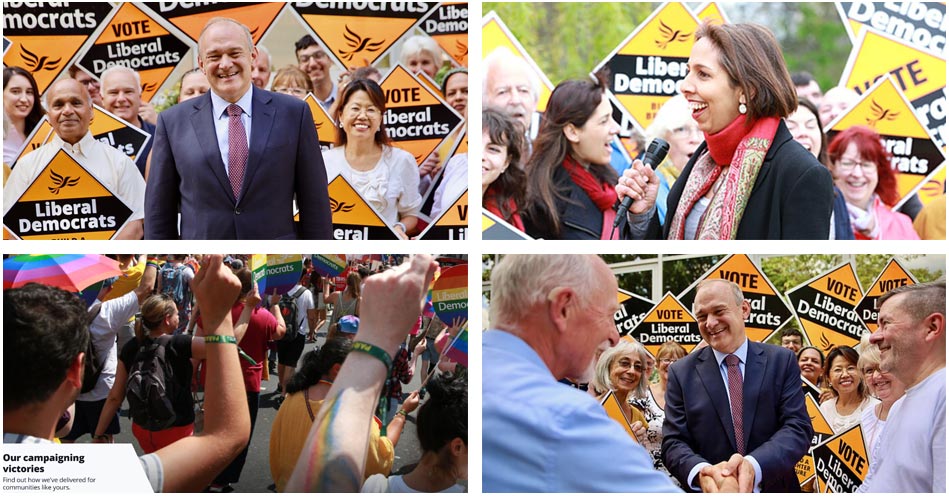
Lib Dems have a very simple and responsive website, which adjusts to screen sizes easily. However, the way it does this hasn’t been thoroughly thought-out and leaves unnecessary gaps in the content and some images become oversized. With the majority of visitors now coming from mobile devices, this is a key factor which should never be overlooked.

The green party is represented by a globe with petals, which almost completely surround the globe. It is clear from this that the parties’ policies might not just benefit the UK but the world with its focus on nature first.
The Green Party’s slogan is ‘Real hope. Real change’ which is similar to the Labour slogan which is simply ‘Change’. Out of the two, the Green Party’s slogan is more emotive and thought provoking which might connect better with their target audience.
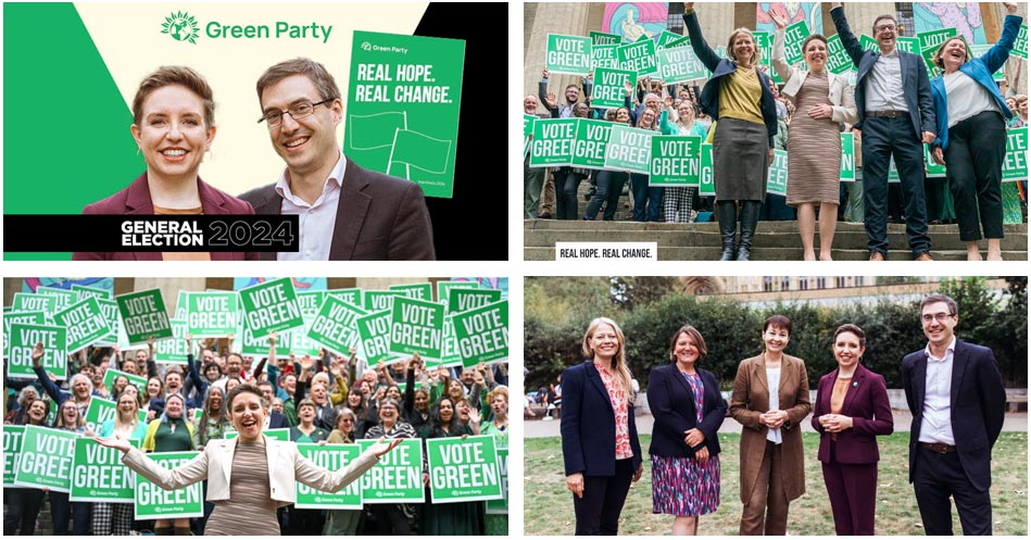
On the Green Party website, branding uses different shades of green which doesn’t really compliment the content, making it feel less consistent, almost amateurish. Darkened images and large black space on the website also doesn’t come across as inspiring or reflect the apparent aim of the party which is full of promise, offering a brighter future.
It must be said most political parties show the national flag to represent a united notion towards something, a trick which the green party might benefit from. They might be focused on helping the planet, but they need to persuade the nation first.
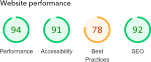
The visual hierarchy of information is very scattered as you scroll through the website, for example too many font styles, accessibility issues and unbalanced content, which all should be addressed.
It might be a conscious decision to not invest in the website to make the point they only spend their money on environmental and social good causes. Their target audience might appreciate that money hasn’t been invested in a shiny new site, but as the single point of contact that most undecided voters may have with their brand, it would appeal to more people if it was updated.
Conclusion
We have voted and put Labour and Conservatives in joint first position when it comes to branding, campaign material and website design. Although Conservative might be slightly ahead with its more polished campaign material. Lib Dems, SNP and Reform have many strong points when it comes to their visual communications and would only take a minor change to really push the parties forwards in terms of branding.
That leaves us with the Green Party in last position, its inconsistency and conflicting visual language means there is a lot of development work needed for the party to really stand proudly among the other parties in terms of its marketing.
At Proteus, we are not endorsing any one party over another. As a voter, it is of course always recommended that you personally research each party’s manifesto and make an informed decision on which party aligns with what you think is best for you, your family and the UK.
The important part is that you do all get out and vote!
Recent Posts
Need help being different?
Here at Proteus we like to make things happen. We use three steps to create a successful brand and blueprint:
- Gather insight
- Picture the future
- Find the difference.
Proteus work with you to understand your objectives, develop a clear proposition that differentiates you from your competitors and then plan, create and seamlessly deliver your communications. We do this by challenging preconceptions, and simplifying the complex while understanding how the latest technology and consumer behaviour trends impact your customers, and how they interact with your brand.


